Friday, June 29, 2007

Sherman Hay - Rock Star

River's Edge by Sherman Hay
58" x 24" x 12"
Sculpture, cast concrete, semi-precious stones,
blown glass by Chaos Glass

I just added Sherman Hay's incredible art to the Rock Star Gallery. Sherman works in stone and says that stone's "beauty is unparalleled as a gift from the heavens." Couldn't have said it better myself. Check out Sherman's page in the Rock Star Gallery.

Wednesday, June 27, 2007

Another Mosaic Rocker Busy at Work

Jenny Perry wearing her favorite T-shirt
and mosaicing a cast of her daughter's pregnant belly.

Sunday, June 24, 2007

Light and Mood - a new project

Continuing my mosaic journey in stone, I want to do something entirely different. Luke was a lot of fun to execute. I learned a lot by reproducing a Byzantine mosaic using marble. But this time I want to do something a bit more personal, creative, and less confined by the classical rules of mosaic making.

During the last few months, I've only worked on tessalated mosaics that implement representational designs. Luke is a good example. Mosaic is the original pixel art form - individual pieces of colored material working together to make a larger image. Because of this, many mosaic images appear to be cartoonish in nature. There's nothing wrong with this. After all, the underlying design which we work from is called a cartoon. But I'd like to experiment with a non-cartoonish design for this project.

I admire people who can do abstract work. They see color and design in a way which I have difficulty doing (so far). They push mosaic into new territory and seem to have fun in playing with materials in new ways. I also love natural stone's palette of color; it's so earthy (of course!). And the range of tonal colors within each stone is amazing.

So for my next project, I want to do something a bit more abstract in which I can experiment with color - particularly color blending.

I have two sources of inspiration for this project.

First - I've been corresponding a lot lately with my mosaic buddies, Karen Sasine and Barbara Peacock. They are planning a trip to Italy this fall to take the Orsoni class and are picking my brain about things to do while in Venice. This made me go back and look at the hundreds of photos I've taken of Venice. These three caught my attention:

San Giorgio Maggiore

Santa Maria della Salute

Grand Canal
There's something about the light in Venice - even on overcast days. And there's something magic about the silhouettes of San Giorgio Maggiore and Santa Maria della Salute which has appealed to artists for centuries. Although they are human creations, they seem to be somehow imprinted in our DNA.
Second - my favorite artist (by far) is JMW Turner (1775-1851). He's called a "painter of light" - perhaps a cliche, but it does describe his revolutionary work. Here are a few of his Venice scenes.

San Giorgio Maggiore

Santa Maria della Salute

Grand Canal


It's hard to imagine that Turner painted these pieces at the end of his career when the likes of Monet and others were still running around in diapers. There's a lot of drama in his work, but these express more tranquility and mystery. Time and space are suspended in a wash of light, color, and mood.

My project is an attempt to capture this feel by using stone in mosaic. On the surface it seems like a study in contrasts. Stone is solid and far from being ethereal and mosaic is mostly about movement. This is the challenge.

The subject is a silhouette San Giorgio Maggiore against the Venetian lagoon and sky. I am using marble cut into small pieces varying in length. I am using the raw, cut part of the stone, gluing them directly onto a 14" x 12" substrate in a rough 3-d fashion. My goal is to create a subtle blending of colors with enough differentiation for the sky, land/buildings, and water.

I'll talk about the colors I'm using in later posts. For now, here's my marble soup:

I cut up pieces and mix them together so that when I work on a section I get plenty of variation in the stone that I'm using. The soup changes as I gradually work from one section to another in the piece by adding - or removing - more or less of a particular color.

All I have is a primitive sketch of San Giorgio Maggiore.


And here's what I've done so far. No movement - no andamento (except for maybe the outline of the dome and campanile) I'm still a bit up in the air about the sky, but I expect that it will have the yellow and rose colors which Turner uses so masterfully.


One last thing about Turner: the Tate in London has the premier collection of Turner's paintings and watercolors. Their website has an extensive listing with thumbnail images of his works.

Saturday, June 23, 2007

French Horn (Sophie Drouin)

(Shhh....) Sophie is a little modest these days thinking that she's taking up too much space in this blog. She's also being very prolific and just produced this mosaic of a french horn for one of her musician friends. How can I not show you this piece?

Just look at what she did with the recent batch of pyrite suns she got from Mosaic Rocks! I'm sure it was painful to break them, but WOW!!!! they're perfect for the bell of this horn. The music coming out of this mosaic is incredible.

Thursday, June 21, 2007

Hey there Lightning Bug,

Your luminescence has always brought joy to us, but you seem to be glowing a bit too brightly these days. It's a temporary phenomena - something necessary to recharge that normal beacon of yours for years to come. Please know that we love you and think about you all the time.

- all the rest of us little bugs

Wednesday, June 20, 2007

The two faces of Luke


The gods of mosaic must be partial to Luke these days.

While I've been chronicling my work on reproducing a Byzantine mosaic of Luke, Julie Richey and Lynn Chinn have also been working on a major commission for the St. Philip's church in Virginia. They have created four mosaics representing the canonical Gospels of Matthew (the man), Mark (the lion), Luke (the ox), and John (the eagle). Here's their Luke along with mine.


You can see more of Julie and Lynn's magnificent Baptistery project here.

I chose to do Luke because I wanted to recreate a Byzantine mosaic as a portrait exercise in marble. I saw this mosaic of Luke in a book on the mosaics at San Marco. He was an interesting face in a book.

But my friend Margaret asserted that we choose the art that we do for a reason and that there must be some significance as to why Luke came into my life at this time. Maybe so. The fact that Julie and Lynn's Luke came into being at the same time only reinforces Margaret's statement. After all, how many years have passed where we haven't even thought about St. Luke and now there are two Lukes in our lives?

I've been thinking about that for the last few weeks and haven't come up with an answer. It's easy to attribute this to simple chance. I found a cool dude in a mosaic book and wanted to replicate it. Julie & Lynn got a commission. It's as simple as that.

But if there is a more mystical reason, it's not hard to fish for an answer. Luke is the patron saint of artists, glass makers, stained glass workers, painters, sculptors, and gold workers (as well as bookbinders, brewers, butchers, doctors, lacemakers, notaries, and unmarried men). So I suppose if mosaic artists were to have a patron saint, Luke would be a good candidate.

Luke was also born in Antioch. All those incredible Roman-era mosaics must have had some influence on him. (Check here and here.)

I'm not religious nor a follower of any institutional religion - but Luke spoke of human love and care for the poor and suffering. Forgiveness and mercy were of first importance to him. And he, more than his cohorts, emphasized the role of women in the ministry. All of these are pretty good reasons to be attracted to him.

Luke was also an evangelist. In the last few years, my life has totally changed from a drone who worked for corporate-America to an evangelist for mosaic art. We have that in common.

Or perhaps his expression reflects my mood these days. (Spring is a dreary part of the year in New England - too cloudy and too cold for a season which should be otherwise.) Sophie and Ginger commented on how the Luke mosaic finally turned out with the choice of Silverwater as the background. Both comments talk about Luke's expression:

(Ginger) The face is somber but not sad, introspective, deeply spiritual. It is the face of this great man who was not only a physician at a time when it meant something to be a physician, but a writer and a historian and, oral tradition tells us, the first iconographer. All this shows in your Luke.

(Sophie) Luke has a quietly pondering sort of sadness that the silverwater echoes. He seems to be brooding a bit, and the siverwater makes that a private moment more than the gold would have. The feeling is heightened, I think. Strange...I was much in favour of the gold, with siverwater a distant third, as I recall. I like the feeling of this piece very much, and I am very glad you went with your gut!

Tuesday, June 19, 2007

Luke

Here he is in all of his glory. You can see a larger version here.

I spent most of the weekend pondering over the background and all the advice the gurus offered. In the end I went with my gut and used the Silverwater marble.

I think mosaic gold would have worked well - particularly a dark copper gold. A darker marble would have worked, too. I was hesitant about using yellow. A brighter yellow background would be good - especially for an icon; however, I used too much yellow in his face and I thought a yellow background would either wash out his face or make him look a little sickly.

So, why Silverwater?

  • Silverwater has a color tone that is not used elsewhere in Luke's head. It offers enough of a contrast to distinguish the head from the background but does not compete with the head.
  • I wanted the mosaic to be all marble. After all, I do promote stone and want to show others what they can do with it.
  • I used a dark background in all my other portraits. I wanted something lighter.
  • I have a special affinity for Silverwater. When Michael and I visited Sophie in Ontario last summer, she took us to a "stone yard" in a nearby town. The place had about ten acres of piles of stone mostly left over from construction jobs. I suppose it's a place where stone goes to die unless someone (like us) finds a special use for it. We found about 5 slabs of this stone and loved its silver-gray color - unlike any of the other gray stones which I offer on the standard Mosaic Rocks sample board. It cuts beautifully. (I do offer it on Mosaic Rocks while my supply lasts. Once it's gone, I won't be able to find more unless I hunt for it back in Ontario.)
  • I am in mortal fear of the wrath of the guru who strongly advocated for Silverwater.
The background is not all Silverwater, however. I did mix in a little Bardiglio Nuvolato. I selected it because it was a little bit darker than the Silverwater, but when I placed it next to the Silverwater stones, it was interesting to see how much blue there was in it. Very interesting.


I did keep the first three rows around Luke solid Silverwater, thinking it would create a subtle halo effect. Well, it turned out to be subtle alright - too subtle.

So, in retrospect was this the correct background choice? I'm happy with it - but I wish I had three other mosaics of Luke's head where I could have tried different backgrounds. It would be an interesting experiment; however, more work than I want to take on.

Not done yet....

I know, I'm being picky, but there are two things that annoy me which I may try to fix.


The first is the color of the marble in his garment on his left side (yellow arrow). This color is too close to the color of the background. In full daylight, it looks OK. At night, however, in artificial light, it blends with the background making the black border of his garment look like it is suspended out in space.

The other issue is one stone on his chin (white arrow). This piece is a little taller than the ones around it and a brighter stone. It needs to go. Few people would notice it, but whenever I look at the Luke's face, I zoom right onto that one piece.

Friday, June 15, 2007

Floor Medallion II (the sequal)


This must be the season for floor medallions. Ginger Terry (Arkansas) is an incredible artist and avid natural stone fan. She recently started a commission to extend a marble bathroom floor into a huge dressing area, office, and exercise room. Big rooms, big mosaic medallions.

Here's a photo of the medallion in it's current state: Says Ginger:

Right now it’s about 17 inches across. It will be 44 inches across. Those strange looking things in the center are aluminum “checkers.” Up until now I’ve put the medallion on that new sticky mosaic contact paper I got at SAMA, which would be fine if the work were no larger than, say, 18 inches across. But the heavier it gets, the more I wonder if it will be possible to flip this thing over!

Ginger also goes on to ask:

What would you do—would you do this thing in sections? Would you lay it indirect so it will be perfectly flat, and if so, how would you go about it? Would you lay it direct on mesh? I’m thinking that I should go ahead and “flip” it onto mesh now, before it gets any bigger, and maybe consider doing it in sections, which will require more technical expertise than I have right now.

If you have any suggestions for her, you can email me and I'll pass your email on to Ginger.

Aside from the medallion, the main part of the floor will be done in 12x12 St Laurent and Pink Petal floor tiles. Ginger loved our pink petal cut marble so much that she ordered 50 sq feet of it from our source in Boston and had it shipped to Arkansas. The shipping almost cost just as much as the tile itself.

Thursday, June 14, 2007

Table Top (Karin Wainwright)


Karin is a good friend from South Africa. She is also one of the driving forces in the growing and thriving mosaic community in South Africa. Last year she was instrumental in getting 26 SA artists to submit their works for the Mosaic Yearbook. No doubt there will be more this year.

Here is a table top she just completed. Check out Karin's website.

Wednesday, June 13, 2007

Mosaic Guru Hotline

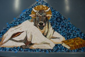
Yesterday I started struggling with the color for Luke's background. There's not a lot of background space to work with, so I was thinking that a solid color would work best and not distract from Luke himself. I picked out a few colors of marble and mosaic-gold and placed pieces on the mosaic to see what the color would look like and then photographed each.


You can see larger versions of these photos here.

I next engaged all of my alter egos in a heated debate - this one too bright; that one too dull; he looks jaundiced; he looks sickly; too gaudy; so on and so on. I quickly got tired of that game. Besides, it's no fun arguing with yourself.

So I got out my phone book, looked up Mosaic Gurus in the yellow pages, and sent them the photos of my dilemma. I told them that I wasn't concerned about making him look saintly and that I didn't necessarily have to follow the tradition of putting a halo around him. Saint or not, he's an interesting dude.

Not surprising, each guru came back with a different answer. Their wisdom is a real gift and has given me a lot to think about.

Here's a summary of their remarks:


Did you not consider using a very dark tone? That's what I see. Sad guy, sitting in the dark. I see you might be concerned about the hair contrast, but I think you could get around it.


In short, my answers for 1st choice etc, are:
In 1st place- Gold
2nd place-Gold
Distant third –silverwater
Even if Luke is just a dude, you’ve spent all that time being accurate about his person, so I think to finish him off in style you should really spring for the gold, which is in the original. It looks like you’ve got bumpy gold there, which looks fabulous, and would be my choice too.


I'm voting Royal Gold or Pistachio.
Royal gold because I think the yellow in that will play into the yellows in the face -- kind of a color link between object and background -- and give the "hint of a halo".
Pistachio because I just like the looks of it.


Pistachio definitely. That will let the face be the focus.


Silverwater: too dull?
royal yellow: I'm likin' it- warm, enough contrast to hair and allows figure to pop.
pistachio - perhaps better as an ice cream treat once background is finished.
mugwort green - hand cut better than square cut tiles, but if that is not issue, color is a bit too light?
green jade - seems this color doesn't relate that well to other marble used.
copper gold - stunning, love it.
blue - not! But good on ya for throwing that into the mix.
gold - too predictable? does lend religious overtone for "Just a Dude"


I vote strongly for silverwater. It is the most muted, and subtle. Second choice would be royal yellow, because it's neutral but rich in color and, like XX says, plays with the same colors in the face.

The reason I like silverwater is that it isn't trying too hard to be matchy, and it allows Luke's face to take precedence over the background. Makes him look as if he appeared in a natural environment. I also will advocate speckling or feathering in from a lighter to a darker color (either direction). And...and, am I getting really bossy and opinionated here? You vill of course make zem zeh same general size as zeh rest of zeh werk, ya. You vill.


My 15 yr old votes for the copper gold. She says that the others blend in too much and the contrast is nice with the copper gold. I agree a bit with her, but also like the pistachio.


I would love to see a blend of the top three colors (royal yellow, pistachio, silverwater) in which you step outwards from brightest (yellow) to darkest (silverwater). This would give it a subtle halo effect.


I vote for Royal Yellow. I think silverwater is too cool...at least on my screen. It seems to pull it down.


I have lots to say, so don’t start rolling your eyes—yet.
I love how you finished out your Luke. He looks great. But don’t kid yourself! I’m not religious either (even though my daddy was a Methodist preacher!!), but there is no getting away from the saintly, long-suffering look he has about him.
Color Choices
That being said- here goes the color theory lesson. The green colors- Pistachio, Mugwart and Jade bring out the green in his face, so they make him look a little sickly—like he needs to vomit—Yikes!
Silverwater, again, brings out the grey tones- so it looks like he’s been dead a long time, yet is resurrected (how biblical).
Blue Gold is just simply too fabulous. You will lose all of your more subtle color choices, and it has a very modern feel to it. Cobalt-y colors were not used much in ancient art because there was no easy way to process the ore. Even today anything this color (like oil paint) is more expensive because of the process of making it. So blue is just not a believable background for your ancient- or Byzantine-styled face. (Unless he’s in Ravenna with the stars).
Okay, Marble-Man, get rid of that [censored] bumpity gold! Throw it out!!! I can’t stand it!!!! (Sorry, got carried away!) The only gold you should use, IF you wanted everyone to know that this dude is a religious figure, is a very dark yellow, antiqued or “crackled” surface. I could send you a free sample of one that I have that could work.
So, that leaves us with your yellow tones. I like your Royal Yellow, but I wish it were a little deeper, not so white-ish. Could you try a color-enhancing liquid on it?
The tone and color of your Copper Gold is wonderful, but I fear it is metallic and we just can’t see that in the photo. Again, a metallic may look very modern, but it is the best color choice, and as long as it is not too pristine I think it could look great. The coppery tone on the Mosaic Smalti board, if this is the one, is very good. Not too shiny/glossy a surface.
Andamento (I know you didn’t ask, but I’m tellin’ ya anyway!)
I very much like the varied sizes and shapes (squares, rectangles, triangles) you’ve got going on in the Copper Gold photo. A non-andamento andamento. Because of the severity of the andamento within the central figure, it would either work well to continue in exactly the same technique, or to do something very different like this “scattered/shattered” look.
The photos where you have the background of perfected cubes of marble lined up—they are not very attractive. The scale is not right, and neither is the uniformity and rigidity of the style for your lovely work. The background would over-power it.


I am voting GOLD.....


I'm looking forward to checking out the decision process on the blog. Backgrounds are always the hardest part for me. I focus so much on composition, and know that in a clinch, the wrong decision can change the entire tone of the piece (no pressure, by the way).


Ah, the background question, a bit hard to tell in pics, but I am curious, what is the color of the line in his collar? You used a thicker, almost light purplish stone there. I am wondering how that would look, it has me curious. I do not think you have that color anywhere else in his face do you?
I also like the Royal Yellow, Pistachio. I love the golds too, but they are a bigger contrast, I am afraid the gold may over power all your hard work and he might fade into the background.

* * *

Well, there you have it. This is such a great wealth of ideas and I thank the gurus for sharing this with me.

I do have my own opinion which is coming more from a gut feeling than from a rational choice. Sometimes it's good to listed to one's gut. Then again, I've observed that the quality that separates good artists from great ones is "intention" - Great artists do things for a reason. It might not be an overly rationalize, thought-out reason, but there is intention behind everything they do.

I'm mulling over the situation.

Tuesday, June 12, 2007

A Mosaic Rocker Busy at Work

Jennifer Johnson in her Palm Springs, CA studio.
Check out her website to see her fun and inspiring mosaics.


Send us a photo of you wearing your Mosaic Rocks! t-shirt while making mosaics and we'll send you a $10 discount off your next purchase. (Take note - photos may be published on our website and blog for all to see. )

Luke - with hair


Luke now has a full head of hair! Well, almost. There is that little bald spot on the top of his head. The hair turned out a little bit different from the original, but I think I like this better. The original was meant to be viewed from a distance, so the contrast between the light and dark waves in his hair would probably be less pronounced. This mosaic is smaller and more intimate.

Now comes the big problem - what to do with the background. Mother Macrina has added some comments to a previous post suggesting that I use a light yellow marble. She pointed out the website http://www.mosaic-art-gallery.com which has some good examples of Byzantine style portraits.

I don't have much space to fill in for the background and I tried placing the yellow marble that I have to see what it would look like. I fear that a yellow background would accentuate the yellow that I used in the face. I'll play around with some colors and let you know what I find out. Any suggestions are most welcome.

Monday, June 11, 2007

Mosaic Atlas Updates

Mosaic Atlas' 2nd anniversary was last month. To date we have 3213 mosaics from 490 different locations in 62 countries throughout the world. 216 people contributed photos to make this all happen.

I just got caught up with the most recent submissions. Here they are:

Michael & I - Boston - Colonial Theatre
Robert Field in the UK is doing research on a mosaic firm from Manchester, UK which existed from the mid 1800s to 1965. Apparently all the records were destroyed when the firm went out of business. One of their commissions was the Colonial Theatre in Boston. I was unaware that this site had such interesting mosaics on the lobby floor.

Also from Massachusetts, James Bowen sent photos of mosaics on Cape Cod. Check out the new mosaics in the Church of the Transfiguration in Orleans.
Barnstable
Orleans
Truro

An Italian Artist, Orodè, sent photos of his work in Lecce, Italy

Kurt and HuQing Piemonte (USA) sent photos of the wonderful Portuguese sidewalk mosaics from Macau (once a colony of Portugal - now a Special Administrative Region of China.

Brian McMorrow (United Arab Emirates) - our pilot/travel photographer sent over 100 photos from Germany and three new countries for the Atlas: Sénégal, Laos, and Syria.
From Laos
From Sénégal
From three locations in Syria
The Umayyad Mosque mosaics are a wonderful example of early Islamic mosaic art.
Also from Germany: East Berlin
West Berlin
Charlottenburg (a district of Berlin)

Wendy Tanner (Australia) - Photos from her travels in Vienna and Camogli, Italy. (Check out the mosaic of the boy peeing outside a men's toilet.)
Also one of her installations in Coffs Harbour, Australia

Josef Norris (California, USA) - CHECK THESE OUT. Three of Josef's large mosaic murals in San Francisco. Look on pages 4 & 5

Kim Grant (Australia) - Mosaics on the War Memorial in Canberra

Virginia Gardner (Virginia, USA) - Mosaic walls of a building that houses a pottery store in Playa del Carmen, Mexico. Here's something to do with pots that tourists break.

Sunday, June 10, 2007

Colonial Theatre - Boston

A while ago Robert Field (UK) asked if I knew about the mosaics in Boston's Colonial Theatre. He was researching Ludwig Oppenheimer Limited a mosaic firm established by Oppenheimer in 1865 in Manchester, England. The firm worked on several major projects in Ireland and England until 1965. Bob mentioned that the Colonial Theatre was the only project done in the United States.

It took a while, but we finally got into the theatre and found the mosaics in the lobby. The design is a frieze of Pompeian-style masks that circumnavigates the room. The main part of the floor is an interestingly irregular opus circumactum.

I can only imagine the thousands of people who go to productions at the theatre and don't even notice this incredible floor.

I posted our photos on the Mosaic Atlas.


(If you've never been to Robert Field's website, do so. He is in my pantheon of mosaic gods. )

Friday, June 8, 2007

A mosaic unlike any you've ever seen...

This is Sophie's latest mosaic. It is unlike any that you've ever seen. Can you tell what it is? (Scroll down to find out.)


In the meantime, here are photos of the finished Cohen hearts floor.


Sophie did the medallion. The fan pattern in the rest of the floor was fabricated in Italy.

Here's Sophie:

"Those marble fan modules are pretty impressive, and the last bit of polishing has made a huge difference in the entire floor. Boy, I’ve sure learned a lot being around while this floor has come to life. First and foremost, it takes a lot of people (and money) to make it happen, and it takes people who really know what they are doing for installation."

And now - drum roll - here is Sophie's mosaic under a black light.


It's title is Ghoti (pronounced "fish").

Thursday, June 7, 2007

War Memorial Update (Connie English)

Connie recently installed her "Daughter" cross at the War Memorial in Lafayette, California. Here's her story:

A few weeks ago I had a conversation with Nadia McCaffrey, about her 6 year old granddaughter, Janessa, who lost her father Patrick (3 years ago) in this war.

This cross is therefore dedicated to Janessa, as her story inspired me to create a cross to represent "all" daughters; the parents of women soldiers, the women themselves and the daughters of soldiers killed in War.

Connie plans to do more of these and will start looking for sponsors. Half of the proceeds will go to a non-profit for soldiers recovering from the war. I'll keep you posted as I find out more.

Wednesday, June 6, 2007

Here come the suns....

We recently visited our source for pyrite suns. He just got back from a trip where he picked up hundreds of them. We were blown away at this batch. The colors in the iridized ones were spectacular - unlike any I've ever seen before. I recently posted them in the Mosaic Rocks shop. Look for them starting at the bottom of the page.

One friend who received a few of these said:

"The pyrite suns came in yesterday. Bill, they are stunning. I was going to do some mosaic Christmas presents featuring them, but I’m not sure I can let them go. In the sun they shimmer in a thousand different colors."


No one really knows what these things are. Pyrite suns are found in one location in the world - a coal mine in Illinois.

People originally thought that these were some type of fossils. The current thinking is that they are pyrite crystals that grow in the seams of coal or shale layers. Since coal is so dense and hard, the crystals can only grow horizontally out. Here's a photo of how they look embedded in the shale.

The sun in the above photo has been cleaned. Usually, they come out of the ground looking something like this - only worse.

Irina Charny sent this one to me. She purchased a number of uncleaned suns a while back. They came encrusted the dark mineral - probably coal or shale. She said she tried everything in the book to clean them up, spending hours scrubbing them. Eventually she discovered that Diet Coke worked best. Who would have thought? Imagine what that stuff does in your stomach.


This is the other side of the same sun - the side she cleaned. Big difference!

Now for the big mystery/secret. There are a few people who clean suns and then put them through some process to tint and/or iridize them. Apparently, this process is a well kept secret. The person who cleans the suns for our dealer told him that someone recently paid $10,000 to get the recipe. It's hard to imagine that it's worth it. I think pyrite suns are very reasonably priced given that they are so rare.

I expect that the silver ones are close to the natural color. Pyrite has a silver/gold color. Natural or not, these iridized ones are just spectacular. Here are some more photos of ones from Mosaic Rocks.


Sonia King is the queen of pyrite suns and needs to be given credit for making them so popular in mosaics. If you haven't see her mosaics, check out the galleries on her website. I asked her if the tinted/iridized suns will lose color over time. She said she hasn't noticed any color loss over the years. Then again, her mosaics aren't that old.

I expect that thousands of years from now when archaeologists are digging up our mosaics, they'll come across these suns and wonder why we used such colorless things in them. But for our lifetimes we can enjoy these magnificent colors.

Tuesday, June 5, 2007

Rock Stars Julie Richey and Lynne Chinn

Julie Richey and Lynne Chinn are rock stars in the truest sense. They recently collaborated on a kitchen project for a client. Julie designed this incredible backsplash based on the clients' love of the Lascaux caves in France. In it she used marble (including some Mosaic Rocks marble) and a tiny bit of eco smalti.


Lynne designed these pieces based on images from New Grange, Ireland. Julie cut the stone opus sectile style on her DL 5000; Lynne inlaid the Bisazza.


Halfway through the longest horizontal piece, Julies DL motor fried and she had to finish it with her hammer and hardie! She said she actually like that part a lot more than if it had been opus sectile.

Monday, June 4, 2007

Luke - Still no hair

After last weekend's hair-razing experience, I decided to work on easier portions of Luke's body: his ear and neck. He's starting to look like a real person - not just a face floating in a void. The ear looks somewhat funny because it's hanging out there, but I expect that it will blend in when I make my next attempt at doing his hair.

Necks are interesting. There is a lot going on in a neck - movement and shadow.

First of all, note the line of tesserae that separates the left side of his beard from his neck (his right - your left). This line also extends down the side of his neck and even breaks out into the neck. The effect is nice, providing a definitive separation between the head and the neck by creating a slight shadow effect. I used a pale green stone for this - the only place in the mosaic where this color occurs. Green was typically used in Byzantine portraits.


One problem I did have was the andamento of the lighter neck stones around this line. There was too much of a noticeable angle in making the corner. This probably occurred because I placed the green line of stones first and then filled in the lighter stones. (This is what happened when I worked on the hair. I started with the strongest line and then tried to fill in the shading around it.)


So I ripped out the stones in this area and built the curved line of lighter stones first. This time I used larger pieces which I think help balance the smaller pieces closer to his beard. The first attempt had too many distinct rows of thinner stones which drew unneeded attention to it.

Once the curved line of lighter stones was in, I rebuilt the stronger line of green stones. The result looks much better.

The hair is next; can't avoid it now. And following the advice of that wise Texan sage, I will pour myself a glass of Vin Santo and dip a few biscottini di Prato before tackling it.

Ultimately I need to decide on the materials to use for the background. Any suggestions?

Friday, June 1, 2007

Mosaic Exhibition

CALL FOR NEW ENGLAND MOSAIC ARTISTS

New England mosaic artists are invited to submit an application for exhibiting their work in an all-mosaic exhibition to be held at the Somerville Museum (Massachusetts), September 6 through October 6, 2007. This exhibition is a first for the Boston area and offers an extraordinary opportunity to expand the understanding and appreciation of contemporary mosaic art in the northeast.

This is an open call for mosaic artists living in Connecticut, Maine, Massachusetts, New Hampshire, Rhode Island, and Vermont. There is a $30 submission fee and a 20% commission for the Somerville Museum collected on sold artwork.

The Prospectus and Submission Form can be found at:
http://www.exhibition.mosaicrocks.com/

Submission Deadline: June 30, 2007

Please help us spread the word by forwarding this Call for Mosaic Artists to your fellow mosaic artists who live in New England.